The Unkindness Festival

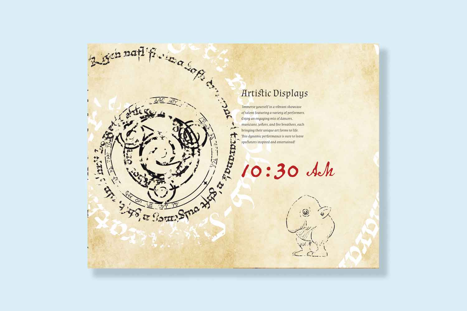
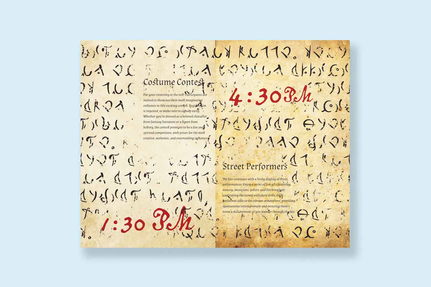
This project is a purely creative outlet with the goal to present provided texts in a chaotic layout. Most rasters and vectors were modified in illustrator and photoshop to give a grungy and worn look. Inspired by the Necronomicon.

E-commerce Project

Booklet Cover

Much like the Necronomicon, I wanted a cover that was embossed to look like something was trying to escape.

E-commerce Project

Date Spread

In many spellbooks, there are runes and symbols laid out chaotically. The date was set to the side with a bright red to draw the attention first.

E-commerce Project

Large Time Spread

Kept the layout simple in terms of graphics to lead the reader into the neatly laid out text that contrasts against the chaotic nature of the book.

E-commerce Project

Condensed Time Spread

The informational text is the only objects that have not been modified in any way to maintain legibility and to draw the readers attention.

E-commerce Project

Creative Spread

The theme of the book was to lead into a sort of beastiary.

E-commerce Project

Date Spread 2

In many spellbooks, there are runes and symbols laid out chaotically. The date was set to the side with a bright red to draw the attention first.